THE SCIENTIST'S GUIDE TO POSTER DESIGN |
I. Pros and cons of poster presentations
Many conferences and symposia will allow presenters to sign up for either an oral or poster presentation. When choosing which presentation type is most appropriate for your research, you should consider the strengths and weaknesses of each.
Advantages of the poster presentation
Meeting organization
Advantages of the poster presentation
Meeting organization
- Many more posters than oral presentations can be presented in the same amount of time, allowing more research to be shared at meetings.
- In some convention centers it is easier to arrange one large room for a poster session than several smaller rooms with audiovisual equipment.
- Compared to the oral presentation, where attendees are limited to a short Q&A session after the talk, posters allow viewers to ask questions organically as they arise, with relaxed time restraints.
- Posters allow plenty of time for intensive discussion of the research, tailored to the interests of the audience.
- The two-way conversation associated with poster sessions affords opportunities for mutually beneficial conversation between presenter and audience.
- Posters, which are generally presented to small groups at a time, can be a relatively low-pressure alternative to intimidating oral presentations.
- Poster sessions provide an environment for young scientists to speak one-on-one with professionals about their research.
- Poster sessions can be convenient places to exchange business cards and other contact information with potential advisors and employers.
- Some research lends itself to graphical communication, making the visual-based poster format highly advantageous.
- Each audience member can control how much time they want to spend at the poster.
- Audience members can ask as many questions as they want.
- Figures are available to view for as long as the audience requires to absorb the information.
- The people who stop to view posters are often genuinely interested in the research. The presenter need not worry that attendees are simply sitting through their presentation while they wait for the next talk to start.
- Posters can be hung at home institutions after the meeting to continue communicating research to students, colleagues, and visiting researchers.
|
Disadvantages of the poster presentation
|
|
II. ORGANIZING your poster
The first step in any graphic design venture (indeed, the first step of any serious venture!) is planning and organization. It should be obvious, but it is worth emphasizing here, that this process begins with READING THE CONFERENCE RULES AND RECOMMENDATIONS. In doing so you should learn two crucial pieces of information:
1. Poster size
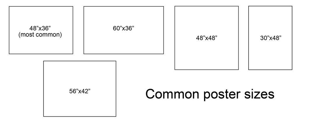
The conference presenter guidelines should provide the size of your poster hanging board. Posters that are larger than their corkboards are common problems at conferences. It makes the poster look unattractive, wrinkles or warps the paper, and potentially blocks neighboring posters. Poster size may also be restricted by the printer you use or by your poster design software (e.g. Powerpoint's max size is 56" x 56"), so learn these restrictions before you start to design.
2. Poster contents
Some meetings and conferences ask that certain sections like abstracts, references, or funding logos be displayed on all posters. If this is the case, and especially if your poster is being judged for a poster competition, it is critical that you include these components. The guidelines may also tell you, for example, that abstracts will be printed in the conference booklet, in which case they can be omitted from the poster to save valuable space for your results.
Some meetings and conferences ask that certain sections like abstracts, references, or funding logos be displayed on all posters. If this is the case, and especially if your poster is being judged for a poster competition, it is critical that you include these components. The guidelines may also tell you, for example, that abstracts will be printed in the conference booklet, in which case they can be omitted from the poster to save valuable space for your results.
|
Typical poster sections are:
|
|
Storyboarding
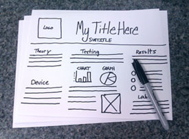
The next step, and one that is often overlooked, is sketching your poster with a pencil and paper. This is called storyboarding, and it provides the first, rough visualization of your poster’s contents. It should contain no content or data; rather, it enables you to visualize the dimensions of your future product, and provides a rough outline of the approximate proportions of space that will be devoted to each section.
The next step, and one that is often overlooked, is sketching your poster with a pencil and paper. This is called storyboarding, and it provides the first, rough visualization of your poster’s contents. It should contain no content or data; rather, it enables you to visualize the dimensions of your future product, and provides a rough outline of the approximate proportions of space that will be devoted to each section.
|
The final organizational step is transferring the hand-written storyboard to an electronic dummy or template. A dummy uses filler text and filler images to establish a rough visual layout that can later be filled in with your actual content. By using filler text, you can establish a word limit for each of your sections a priori, write the content of these sections in a word processing software, then quickly and easily transfer each written section into its proper space. Similarly, you can determine the dimensions of your figures and photos ahead of time, crop and edit them in the program of your choice, and fit them smoothly in place later. Poster expert Colin Purrington provides several poster templates on his website, linked here.
|
III. software options for poster design
At today's conferences, you'll be hard-pressed to find a poster made in the traditional way (many small pieces of paper taped together or glued to a posterboard). Instead, posters are now designed entirely on the computer, then printed on a large plotter printer or similar machine. There are many software options for putting your poster together, including Adobe InDesign, Microsoft Powerpoint, and Scribus, each with their own strengths and weaknesses. Note that, for all of these programs, the intent is organizing and laying out content sections on a large scale, not necessarily producing all the smaller graphs and figures. You should create graphs and figures in a separate program or file, then import them into the poster itself later.
Adobe InDesign
Pros: This is a popular program that was specifically made for print layout design. The tools are user-friendly and there are a lot of online sources to help learn the program. This is my top choice. Note that Adobe Illustrator or Powerpoint also work well.
Cons: If your school or organization does not provide this program for free or a reduced cost, it is rather expensive. There is also a learning curve, so a poster may take longer than expected to produce (but you can learn Adobe Indesign through my InDesign tutorial here).
Microsoft Powerpoint
Pros: You likely already own it and know how to use it.
Cons: The makers of Powerpoint did NOT intend for it to be used to make large printed posters. While you may find that many people use it for poster-making, I don't think it's the best choice. Wrapping and alignment can be clunky to use, color and font sizing may appear quite different in print than they look on the screen, and the max poster size allowed is 56"x56". I highly recommend learning another program, but Powerpoint will get the job done if necessary.
Scribus
Pros: This is a free and open source program. It was intended for designing print page layouts, so the tools included are exactly what you need. There is a good online support community, and it works on all operating systems. I have never used Scribus, but many people recommend it.
Cons: There may be a learning curve, and chances are your advisor or colleagues won't know how to help if you get stuck.
Other Programs
I have never used these programs, but many people recommend LaTeX, PosterGenius, QuarkXPress, CorelDRAW, Adobe Freehand, or Omnigraffle.
IV. Design guidelines for academic posters
While there is no standard formula for academic posters, below are some tried-and-true formatting options.
A. layout
|
Guideline #1: Let it breathe
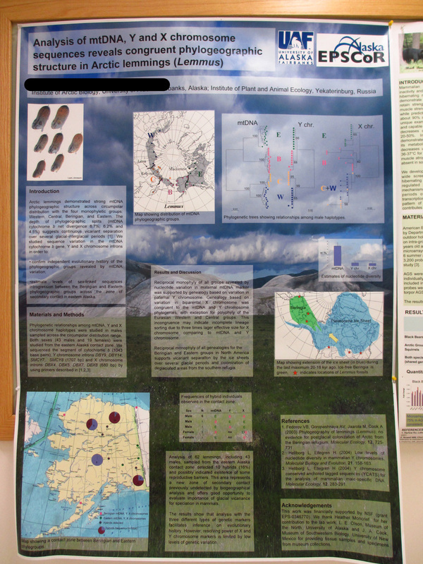
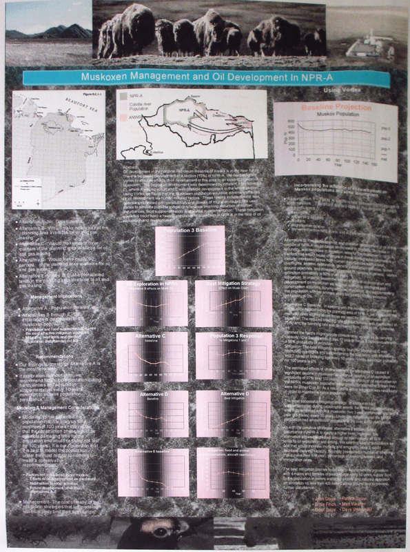
A common problem, like in the poster to the right, is that all of the poster's elements are crammed too tightly into the space. It's natural to want to make the most of the limited space that you have, but cramming everything in like this makes your poster look cluttered. When you're making your poster, provide a wide gap between each element or section to the next, then double that distance--it's almost always better to give too much breathing room than too little! The margin around the entire poster should be at least 2 inches. |
|
Guideline #2: Keep it lined up
Working on an invisible grid is one of the best things you can do to make your poster look more professional. The poster on the left did a good job of lining up all the elements on the far left edge as well as the far right edge, but the elements in the middle appear to be placed at random. This could easily be converted into a clean, 2- or 3-column grid format to achieve a more professional look. Note also that there are variable gap sizes between each of the poster's sections. Guideline #3: Tell the reader where to go By laying out your poster in an organized way, you can force your reader's eyes to travel where you want. Our natural tendency is to read from left to right, then top to bottom. In the poster on the left, notice how your eyes start in the upper lefthand corner, but then there are no visual cues to tell you whether to go to the right from there, or down the column. Read my section on creating a visual hierarchy to learn more about controlling eye movement. |
Poster expert Colin Purrington provides several basic, functional poster templates on his website, linked here. No creativity required (although it is encouraged)!
B. sizes
An explanation of posterboard sizes can be found in the "Organizing your poster" section above.
Sizes of each content section can vary considerably with each presenter's research content. However, in general the "results" section should make up the greatest proportion of your poster's real estate. I like to aim for my poster to have a max. of 1000 words total. Here is a rough word count for each section:
Sizes of each content section can vary considerably with each presenter's research content. However, in general the "results" section should make up the greatest proportion of your poster's real estate. I like to aim for my poster to have a max. of 1000 words total. Here is a rough word count for each section:
|
Title: 1-2 lines max.
Introduction: ~200 words Aims/Objectives (if included): <100 words Materials and Methods: ~200 words Results: ~200 words not including figure captions Conclusions: ~200 words Acknowledgements: <100 words in a small font size References: 5-10 citations in an extremely small font size |
Helpful Tip! |
When choosing your font size, bigger is generally better. A rule of thumb for designers is that 30pt font is visible from 6 feet away. Below I show my preferred font sizes for each poster section. I highly recommend that you do not deviate much from these sizes!
c. fonts
Font choice may seem petty in the grand scheme of things, but I've found that a good or bad font can really make or break a poster. Below you'll find my three simple rules of font choice:
|
Rule #1: Be consistent
Once you've chosen a font for the section heading "Introduction", use the exact same font for all of your other content section headings as well. Similarly, all of your photo and figure captions should use the same font, and all of your main body text should use the same font. These fonts may differ from one section to the other (see Rule #2), but they should remain consistent across each group. |
Helpful tip! |
|
Rule #2: Stick to two complementary fonts
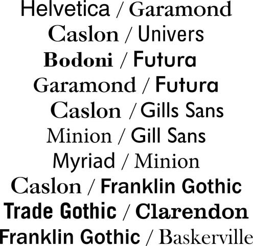
Many print designers like to pair one serif font with one sans serif font (see my Design 101 typography section for the difference between these types), and use only those two fonts throughout their work. This is a good rule to adopt for poster design, although I have also seen successful posters with just one or up to three fonts choices. On the left are some aesthetically-pleasing font choices for titles/body text, adopted from MakeSigns.com's poster-making guide. In general, I like to use the first font for my title and section headings, and the second font for the author name and the main body text. Either may be used for captions, but again, stay consistent! |
|
Rule #3: Say no to word art
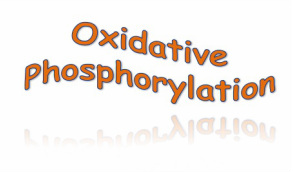
Word art, drop shadows, and gradients are no-no's for scientific conferences. Simply put, font styles like that on the right don't convey a "professional" message. Similarly, so-called "designer" fonts are inappropriate -- the font called Comic Sans is a common culprit, and should be avoided! |
d. colors
|
- Whenever possible, I like to use the "eyedropper" tool offered by many design software programs, which allows you to pull a color out of a picture and apply it to parts of your poster. Suppose, for example, that your poster uses several pictures from your fieldwork on the beach. This tool would allow you to pull the cream color from the beach sand to be used as your poster's background color, and the blue color of the ocean to be used as the title's font color.
- Use a site like kuler.adobe.com to pick a color palette and stick to those 3-5 colors throughout.
- Be aware of the subconscious message you may be sending your audience. Many colors are associated with certain feelings. Blue and green, for example, are the colors most often used for doctors' and surgeons' scrubs, because those colors convey relaxation and loyalty; they are a good choice for posters. Bright reds and yellows, on the other hand, can induce anxiety, which may stem from the aposematic red and yellow coloration of venomous animals.
- Avoid excessive use of gradients and patterns, which do not convey a professional message.
e. photos and graphics
- Avoid pulling photos off the Internet. Odds are, these photos will be low image quality, which prints terribly when blown up on a large poster. Use your own pictures whenever possible, or limit image searches to large sizes (at least 150 dpi but no larger than 300).
- Do NOT copy photos from the internet or other documents and paste them into your poster. These photos may look fine at first, but they tend to become easily corrupted or print incorrectly later. Instead, save these images to your computer and use the "import" or "place" tool in your poster design software to insert it.
- Graphs and figures should be saved as PNGs before being imported. PNG is a good file type for images with lots of text and lines, with little risk that they will look pixelated.
- Pictures should be saved as TIFFs before being imported. TIFFs tend to produce good quality images when printed on large posters. If file size gets too big, however, JPGs are OK and generally smaller.
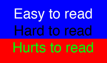
left: text printed directly on a busy background can be almost impossible to read! |
V. Printing and presenting
Critique a draft before printing
Printing
Traveling and Presenting
- About a month before the conference, it is critical that you receive edits to your poster from friends and colleagues (helpful tip: graduate students respond well to bribes of free food). Ask them to edit miniature versions, or display the poster on a large conference room screen and have them place notes with post-its.
- Solicit comments on your poster through the internet. One Flickr community, Pimp My Poster, provides critical feedback from either strangers (probably more helpful) or friends, depending on your privacy settings.
- Posters generally print with fewer issues when they are exported to pdf format before going to the printer.
- Print a small version of your poster on paper like the type you will ultimately print on (matte, semiglossy, or glossy) to see how the colors look -- colors often look quite different in print than they did on the screen!
Printing
- I recommend printing on semiglossy paper if possible. Ultraglossy or laminated posters reflect too much light and cannot be read from a distance, and matté paper tends to get soggy easily.
- Use your school's printing services, if available, to get the best price. At Ohio State, for example, I was able to print 2 matté posters for $24 through the library. Places like FedEx Office will also print posters, but charge a significant fee ($130 for a 36"x48" poster at last check!). If your school does not have a printing service, the best alternative is an online business like makesigns.com, which can even ship your poster directly to the conference hotel. Note, however, that these should be sent at least a week in advance.
Traveling and Presenting
- Always travel with your poster safely inside a plastic or cardboard tube. If you don't, expect your poster to arrive at the conference wet, torn, and wrinkled.
- Poster sessions are a great place to network, so print business cards and have them on-hand while you're presenting.
- Dress to impress! If you get really ambitious, you can even dress to match your poster.
- Prepare a 3-5 minute speech about your poster and practice it several times before the conference. Note, however, that you may not get to use the speech at all! Many people like to have conversations at poster sessions rather than listen to a talk.
VI. External Links and Resources
Online resources with more poster-making tips
https://chroniclevitae.com/news/379-seduction-in-the-poster-session
Books and literature
http://www.tos.org/pdfs/sci_speaking.pdf
Erren TC, Bourne PE (2007) Ten Simple Rules for a Good Poster Presentation. PLoS Comput Biol 3(5): e102. doi:10.1371/journal.pcbi.0030102
Briscoe, M.H. Preparing Scientific Illustrations: A Guide to Better Posters, Presentations, and Publications, (2nd ed.). New York: Springer; 1996. Posters; p 131-149.
Gosling, P.J. Scientist's Guide to Poster Presentations. New York: Kluwer Academic/Plenum Press; 1999. 139 pp.
See sample posters and get critiques
http://www.flickr.com/photos/89596909@N05/sets/72157631922038937/
General visual communication help for scientists
http://vimeo.com/channels/288683/53464051
https://chroniclevitae.com/news/379-seduction-in-the-poster-session
- My own advice column about poster design, featured on the the Chronicle of Higher Education's online resource, Vitae.
- One of the most comprehensive guides to poster-making
- An excellent guide to poster making from a design perspective
- A great webinar on poster sessions
- Another comprehensive poster-making guide
- The slide design isn't great, but this powerpoint PDF has a lot of helpful content
- A short but helpful site with sample posters and templates
Books and literature
http://www.tos.org/pdfs/sci_speaking.pdf
- A PDF guide to science communication from the Oceanography Society
- An article published in The Scientist on poster sessions
- "Mortal Sins in Poster Presentations or How to Give the Poster No One Remembers," published in the Society for Integrative and Comparative Biology's newsletter
Erren TC, Bourne PE (2007) Ten Simple Rules for a Good Poster Presentation. PLoS Comput Biol 3(5): e102. doi:10.1371/journal.pcbi.0030102
Briscoe, M.H. Preparing Scientific Illustrations: A Guide to Better Posters, Presentations, and Publications, (2nd ed.). New York: Springer; 1996. Posters; p 131-149.
Gosling, P.J. Scientist's Guide to Poster Presentations. New York: Kluwer Academic/Plenum Press; 1999. 139 pp.
See sample posters and get critiques
http://www.flickr.com/photos/89596909@N05/sets/72157631922038937/
- My personal gallery of posters. Pictures taken at my school and at conferences
- A great place to see other posters and get critiques on your drafts
- A few sample posters
- Photos from the CURIS poster session
- Another flickr pool for scientific posters
General visual communication help for scientists
http://vimeo.com/channels/288683/53464051
- An AMAZING webinar on Graphic Design 101 for scientists
- Graphic Designer's Essential Reference by Timothy Samara (may be available free online through your university)


