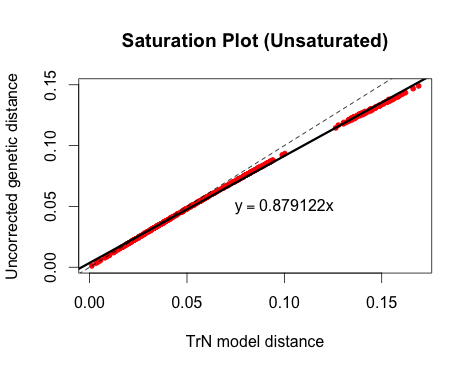
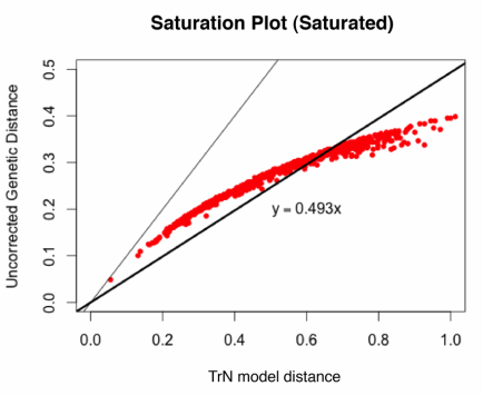
There are a lot of ways to visualize saturation. One method, which I believe was originally used by Philippe et al. (1994), is to plot the raw or uncorrected pairwise genetic distances in an alignment against model-corrected genetic distances. If the relationship is approximately linear, then the gene is not saturated; if the line curves or plateaus, there is evidence of saturation.
Here is an example of an unsaturated gene:
library(ape)
###Input data: a phylip-format alignment file, converted to a 'DNAbin' object###
dat<-read.dna(file="myData.phy", format = "sequential", as.character=TRUE, skip=0)
dat<-as.DNAbin(dat)
###Convert to genetic distances###
dist<-dist.dna(dat, model="raw")
dist.corrected<-dist.dna(dat, model="TN93")
###Make plot###
plot(dist~dist.corrected, pch=20, col="red", xlab="TrN model distance", ylab="Uncorrected genetic distance", main="Saturation Plot")
abline(0,1, lty=2)
abline(lm(dist~dist.corrected), lwd=3)
lm_coef<-coef(lm(dist~dist.corrected))
text(0.1,0.05,bquote(y == .(lm_coef[2])*x))


 RSS Feed
